2.6 KiB
2.6 KiB
title: "Combo boxes | Apple Developer Documentation"
source: https://developer.apple.com/design/human-interface-guidelines/combo-boxes
# Combo boxes
A combo box combines a text field with a pull-down button in a single control.
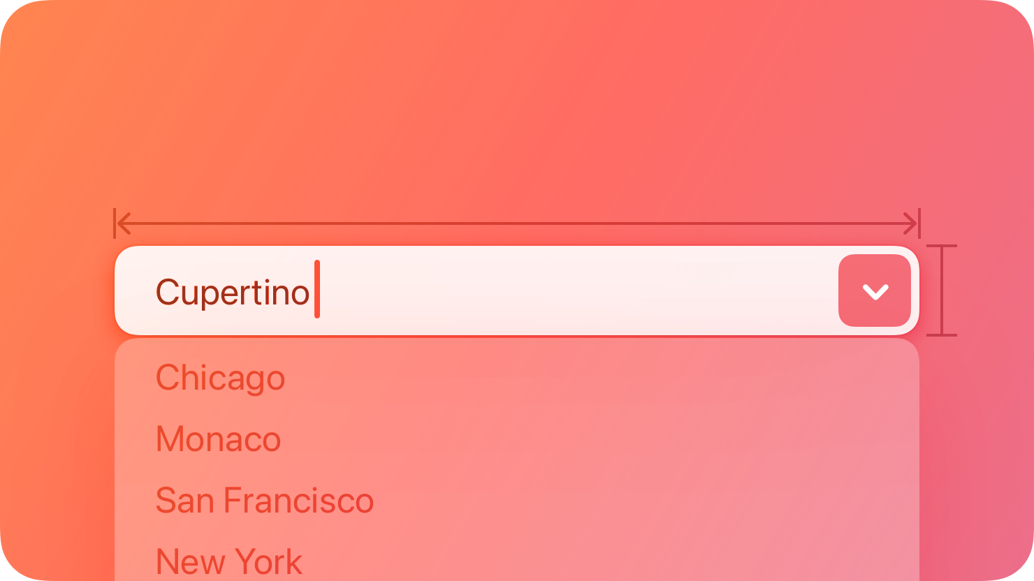 People can enter a custom value into the field or click the button to choose from a list of predefined values. When people enter a custom value, it’s not added to the list of choices.
## Best practices
Populate the field with a meaningful default value from the list. Although the field can be empty by default, it’s best when the default value refers to the hidden choices. The default value doesn’t have to be the first item in the list.
Use an introductory label to let people know what types of items to expect. Generally, use title-style capitalization for labels and end them with a colon. For related guidance, see Labels.
Provide relevant choices. People appreciate the ability to enter a custom value, as well as the convenience of choosing from a list of the most likely choices.
Make sure list items aren’t wider than the text field. If an item is too wide, the text field might truncate it, which is hard for people to read.
For guidance, see Text fields and Pull-down buttons.
## Platform considerations
Not supported in iOS, iPadOS, tvOS, visionOS, or watchOS.
## Resources
#### Related
Text fields
Pull-down buttons
#### Developer documentation
People can enter a custom value into the field or click the button to choose from a list of predefined values. When people enter a custom value, it’s not added to the list of choices.
## Best practices
Populate the field with a meaningful default value from the list. Although the field can be empty by default, it’s best when the default value refers to the hidden choices. The default value doesn’t have to be the first item in the list.
Use an introductory label to let people know what types of items to expect. Generally, use title-style capitalization for labels and end them with a colon. For related guidance, see Labels.
Provide relevant choices. People appreciate the ability to enter a custom value, as well as the convenience of choosing from a list of the most likely choices.
Make sure list items aren’t wider than the text field. If an item is too wide, the text field might truncate it, which is hard for people to read.
For guidance, see Text fields and Pull-down buttons.
## Platform considerations
Not supported in iOS, iPadOS, tvOS, visionOS, or watchOS.
## Resources
#### Related
Text fields
Pull-down buttons
#### Developer documentation
NSComboBox — AppKit