5.2 KiB
5.2 KiB
title: "Tab views | Apple Developer Documentation"
source: https://developer.apple.com/design/human-interface-guidelines/tab-views
# Tab views
A tab view presents multiple mutually exclusive panes of content in the same area, which people can switch between using a tabbed control.
 ## Best practices
Use a tab view to present closely related areas of content. The appearance of a tab view provides a strong visual indication of enclosure. People expect each tab to display content that is in some way similar or related to the content in the other tabs.
Make sure the controls within a pane affect content only in the same pane. Panes are mutually exclusive, so ensure they’re fully self-contained.
Provide a label for each tab that describes the contents of its pane. A good label helps people predict the contents of a pane before clicking or tapping its tab. In general, use nouns or short noun phrases for tab labels. A verb or short verb phrase may make sense in some contexts. Use title-style capitalization for tab labels.
Avoid using a pop-up button to switch between tabs. A tabbed control is efficient because it requires a single click or tap to make a selection, whereas a pop-up button requires two. A tabbed control also presents all choices onscreen at the same time, whereas people must click a pop-up button to see its choices. Note that a pop-up button can be a reasonable alternative in cases where there are too many panes of content to reasonably display with tabs.
Avoid providing more than six tabs in a tab view. Having more than six tabs can be overwhelming and create layout issues. If you need to present six or more tabs, consider another way to implement the interface. For example, you could instead present each tab as a view option in a pop-up button menu.
For developer guidance, see
## Best practices
Use a tab view to present closely related areas of content. The appearance of a tab view provides a strong visual indication of enclosure. People expect each tab to display content that is in some way similar or related to the content in the other tabs.
Make sure the controls within a pane affect content only in the same pane. Panes are mutually exclusive, so ensure they’re fully self-contained.
Provide a label for each tab that describes the contents of its pane. A good label helps people predict the contents of a pane before clicking or tapping its tab. In general, use nouns or short noun phrases for tab labels. A verb or short verb phrase may make sense in some contexts. Use title-style capitalization for tab labels.
Avoid using a pop-up button to switch between tabs. A tabbed control is efficient because it requires a single click or tap to make a selection, whereas a pop-up button requires two. A tabbed control also presents all choices onscreen at the same time, whereas people must click a pop-up button to see its choices. Note that a pop-up button can be a reasonable alternative in cases where there are too many panes of content to reasonably display with tabs.
Avoid providing more than six tabs in a tab view. Having more than six tabs can be overwhelming and create layout issues. If you need to present six or more tabs, consider another way to implement the interface. For example, you could instead present each tab as a view option in a pop-up button menu.
For developer guidance, see 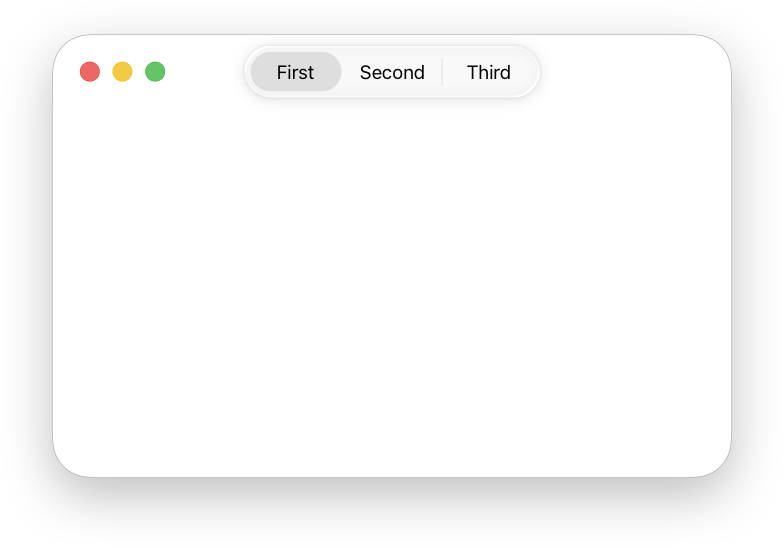 When you hide the tabbed control, the content area can be borderless, bezeled, or bordered with a line. A borderless view can be solid or transparent.
In general, inset a tab view by leaving a margin of window-body area on all sides of a tab view. This layout looks clean and leaves room for additional controls that aren’t directly related to the contents of the tab view. You can extend a tab view to meet the window edges, but this layout is unusual.
## Platform considerations
Not supported in iOS, iPadOS, tvOS, or visionOS.
### iOS, iPadOS
For similar functionality, consider using a segmented control instead.
### watchOS
watchOS displays tab views using page controls. For developer guidance, see
When you hide the tabbed control, the content area can be borderless, bezeled, or bordered with a line. A borderless view can be solid or transparent.
In general, inset a tab view by leaving a margin of window-body area on all sides of a tab view. This layout looks clean and leaves room for additional controls that aren’t directly related to the contents of the tab view. You can extend a tab view to meet the window edges, but this layout is unusual.
## Platform considerations
Not supported in iOS, iPadOS, tvOS, or visionOS.
### iOS, iPadOS
For similar functionality, consider using a segmented control instead.
### watchOS
watchOS displays tab views using page controls. For developer guidance, see 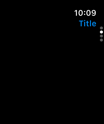 ## Resources
#### Related
Tab bars
Segmented controls
#### Developer documentation
## Resources
#### Related
Tab bars
Segmented controls
#### Developer documentation
---|---
June 5, 2023| Added guidance for using tab views in watchOS.
## Best practices
Use a tab view to present closely related areas of content. The appearance of a tab view provides a strong visual indication of enclosure. People expect each tab to display content that is in some way similar or related to the content in the other tabs.
Make sure the controls within a pane affect content only in the same pane. Panes are mutually exclusive, so ensure they’re fully self-contained.
Provide a label for each tab that describes the contents of its pane. A good label helps people predict the contents of a pane before clicking or tapping its tab. In general, use nouns or short noun phrases for tab labels. A verb or short verb phrase may make sense in some contexts. Use title-style capitalization for tab labels.
Avoid using a pop-up button to switch between tabs. A tabbed control is efficient because it requires a single click or tap to make a selection, whereas a pop-up button requires two. A tabbed control also presents all choices onscreen at the same time, whereas people must click a pop-up button to see its choices. Note that a pop-up button can be a reasonable alternative in cases where there are too many panes of content to reasonably display with tabs.
Avoid providing more than six tabs in a tab view. Having more than six tabs can be overwhelming and create layout issues. If you need to present six or more tabs, consider another way to implement the interface. For example, you could instead present each tab as a view option in a pop-up button menu.
For developer guidance, see NSTabView.
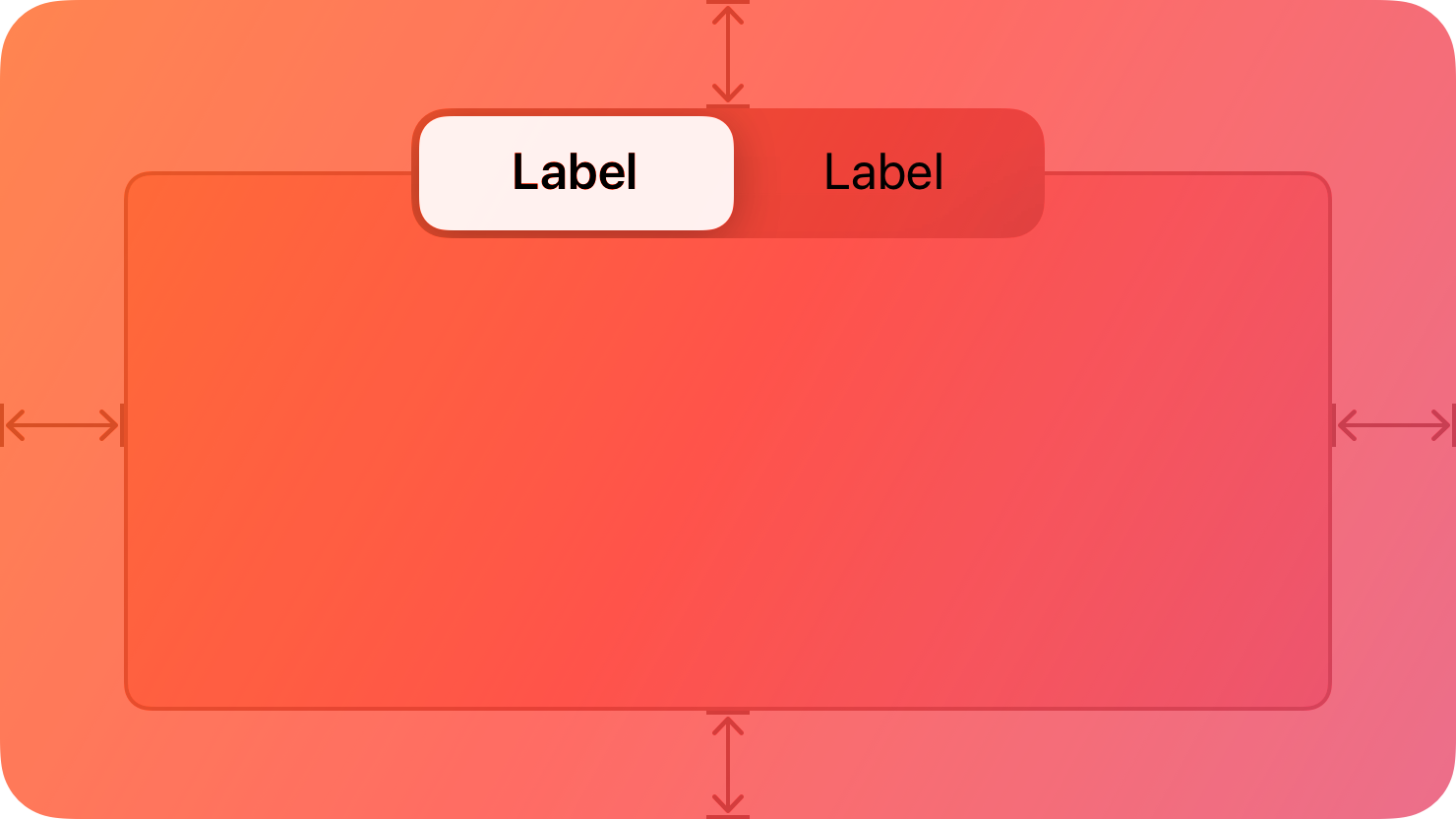
## Anatomy
The tabbed control appears on the top edge of the content area. You can choose to hide the control, which is appropriate for an app that switches between panes programmatically.
When you hide the tabbed control, the content area can be borderless, bezeled, or bordered with a line. A borderless view can be solid or transparent.
In general, inset a tab view by leaving a margin of window-body area on all sides of a tab view. This layout looks clean and leaves room for additional controls that aren’t directly related to the contents of the tab view. You can extend a tab view to meet the window edges, but this layout is unusual.
## Platform considerations
Not supported in iOS, iPadOS, tvOS, or visionOS.
### iOS, iPadOS
For similar functionality, consider using a segmented control instead.
### watchOS
watchOS displays tab views using page controls. For developer guidance, see TabView and verticalPage.
## Resources
#### Related
Tab bars
Segmented controls
#### Developer documentation
TabView — SwiftUI
NSTabView — AppKit
## Change log
Date| Changes---|---
June 5, 2023| Added guidance for using tab views in watchOS.