12 KiB
12 KiB
title: "Writing | Apple Developer Documentation"
source: https://developer.apple.com/design/human-interface-guidelines/writing
# Writing
The words you choose within your app are an essential part of its user experience.
 Whether you’re building an onboarding experience, writing an alert, or describing an image for accessibility, designing through the lens of language will help people get the most from your app or game.
## Getting started
Determine your app’s voice. Think about who you’re talking to, so you can figure out the type of vocabulary you’ll use. What types of words are familiar to people using your app? How do you want people to feel? The words for a banking app might convey trust and stability, for example, while the words in a game might convey excitement and fun. Create a list of common terms, and reference that list to keep your language consistent. Consistent language, along with a voice that reflects your app’s values, helps everything feel more cohesive.
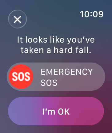
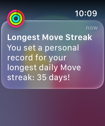
Match your tone to the context. Once you’ve established your app’s voice, vary your tone based on the situation. Consider what people are doing while they’re using your app — both in the physical world and within the app itself. Are they exercising and reached a goal? Or are they trying to make a payment and received an error? Situational factors affect both what you say and how you display the text on the screen.
Compare the tone of these two examples from Apple Watch. In the first, the tone is straightforward and direct, reflecting the seriousness of the situation. In the second, the tone is light and congratulatory.
Whether you’re building an onboarding experience, writing an alert, or describing an image for accessibility, designing through the lens of language will help people get the most from your app or game.
## Getting started
Determine your app’s voice. Think about who you’re talking to, so you can figure out the type of vocabulary you’ll use. What types of words are familiar to people using your app? How do you want people to feel? The words for a banking app might convey trust and stability, for example, while the words in a game might convey excitement and fun. Create a list of common terms, and reference that list to keep your language consistent. Consistent language, along with a voice that reflects your app’s values, helps everything feel more cohesive.
Match your tone to the context. Once you’ve established your app’s voice, vary your tone based on the situation. Consider what people are doing while they’re using your app — both in the physical world and within the app itself. Are they exercising and reached a goal? Or are they trying to make a payment and received an error? Situational factors affect both what you say and how you display the text on the screen.
Compare the tone of these two examples from Apple Watch. In the first, the tone is straightforward and direct, reflecting the seriousness of the situation. In the second, the tone is light and congratulatory.
 Be clear. Choose words that are easily understood and convey the right thing. Check each word to be sure it needs to be there. If you can use fewer words, do so. When in doubt, read your writing out loud.
Write for everyone. For your app to be useful for as many people as possible, it needs to speak to as many people as possible. Choose simple, plain language and write with accessibility and localization in mind, avoiding jargon and gendered terminology. For guidance, see Writing inclusively and VoiceOver; for developer guidance, see Localization.
## Best practices
Consider each screen’s purpose. Pay attention to the order of elements on a screen, and put the most important information first. Format your text to make it easy to read. If you’re trying to convey more than one idea, consider breaking up the text onto multiple screens, and think about the flow of information across those screens.
Be action oriented. Active voice and clear labels help people navigate through your app from one step to the next, or from one screen to another. When labeling buttons and links, it’s almost always best to use a verb. Prioritize clarity and avoid the temptation to be too cute or clever with your labels. For example, just saying “Send” often works better than “Let’s do it!” For links, avoid using “Click here” in favor of more descriptive words or phrases, such as “Learn more about UX Writing.” This is especially important for people using screen readers to access your app.
Build language patterns. Consistency builds familiarity, helping your app feel cohesive, intuitive, and thoughtfully designed. It also makes writing for your app easier, as you can return to these patterns again and again.
Adopt capitalization rules that align with your app’s style, then apply them consistently. While certain components, like button labels, have specific guidelines, how you format text reflects your app’s voice. Title case is generally considered formal, while sentence case is more casual. Choose a style for each UI element type and use it consistently throughout your app — for example, title case for all alerts or sentence case for all headlines.
Give clear guidance and use consistent language throughout processes with multiple steps. If your app has a flow that spans multiple screens, decide how you want to label the actions that take people from one step to the next. Begin with language like “Get Started” to indicate you’re starting a flow. You can use the button label to hint at the next step, or use terms like “Continue” or “Next,” but be consistent with what you choose. Make it clear when a flow is complete by using language like “Done.”
Use possessive pronouns sparingly. Possessive pronouns like my and your are often unnecessary to establish context. For example, “Favorites” conveys the same message as “Your Favorites,” and is more succinct. If you do use possessive pronouns, use them consistently throughout your app, and try not to switch perspectives. Avoid using we altogether because it may be unclear who the “we” in question refers to. This is particularly problematic in error messages like “We’re having trouble loading this content.” Something like “Unable to load content” is much clearer.
Write for how people use each device. People may use your app on several types of devices. While your language needs to be consistent across them, think about where it would be helpful to adjust your text to make it suitable for different devices. Make sure you describe gestures correctly on each device — for example, not saying “click” for a touch device like iPhone or iPad where you mean “tap.”
Where and how people use a device, its screen size, and its location all affect how you write for your app. iPhone and Apple Watch, for example, offer opportunities for personalization, but their small screens require brevity. TVs, on the other hand, are often in common living spaces, and several people are likely to see anything on the screen, so consider who you’re addressing. Bigger screens also require brevity, as the text must be large for people to see it from a distance.
Provide clear next steps on any blank screens. An empty state, like a completed to-do list or bookmarks folder with nothing in it, can provide a good opportunity to make people feel welcome and educate them about your app. Empty states can also showcase your app’s voice, but make sure that the content is useful and fits the context. An empty screen can be daunting if it isn’t obvious what to do next, so guide people on actions they can take, and give them a button or link to do so if possible. Remember that empty states are usually temporary, so don’t show crucial information that could then disappear.
Write clear error messages. It’s always best to help people avoid errors. When an error message is necessary, display it as close to the problem as possible, avoid blame, and be clear about what someone can do to fix it. For example, “That password is too short” isn’t as helpful as “Choose a password with at least 8 characters.” Remember that errors can be frustrating. Interjections like “oops!” or “uh-oh” are typically unnecessary and can sound insincere. If you find that language alone can’t address an error that’s likely to affect many people, use that as an opportunity to rethink the interaction.
Choose the right delivery method. There are many ways to get people’s attention, whether or not they are actively using your app. When there’s something you want to communicate, consider the urgency and importance of the message. Think about the context in which someone might see the message, whether it requires immediate action, and how much supporting information someone might need. Choose the correct delivery method, and use a tone appropriate for the situation. For guidance, see Notifications, Alerts, and Action sheets.
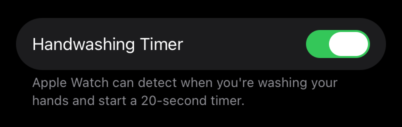
Keep settings labels clear and simple. Help people easily find the settings they need by labeling them as practically as possible. If the setting label isn’t enough, add an explanation. Describe what it does when turned on, and people can infer the opposite. In the Handwashing Timer setting for Apple Watch, for example, the description explains that a timer can start when you’re washing your hands. It isn’t necessary to tell you that a timer won’t start when this setting is off.
Be clear. Choose words that are easily understood and convey the right thing. Check each word to be sure it needs to be there. If you can use fewer words, do so. When in doubt, read your writing out loud.
Write for everyone. For your app to be useful for as many people as possible, it needs to speak to as many people as possible. Choose simple, plain language and write with accessibility and localization in mind, avoiding jargon and gendered terminology. For guidance, see Writing inclusively and VoiceOver; for developer guidance, see Localization.
## Best practices
Consider each screen’s purpose. Pay attention to the order of elements on a screen, and put the most important information first. Format your text to make it easy to read. If you’re trying to convey more than one idea, consider breaking up the text onto multiple screens, and think about the flow of information across those screens.
Be action oriented. Active voice and clear labels help people navigate through your app from one step to the next, or from one screen to another. When labeling buttons and links, it’s almost always best to use a verb. Prioritize clarity and avoid the temptation to be too cute or clever with your labels. For example, just saying “Send” often works better than “Let’s do it!” For links, avoid using “Click here” in favor of more descriptive words or phrases, such as “Learn more about UX Writing.” This is especially important for people using screen readers to access your app.
Build language patterns. Consistency builds familiarity, helping your app feel cohesive, intuitive, and thoughtfully designed. It also makes writing for your app easier, as you can return to these patterns again and again.
Adopt capitalization rules that align with your app’s style, then apply them consistently. While certain components, like button labels, have specific guidelines, how you format text reflects your app’s voice. Title case is generally considered formal, while sentence case is more casual. Choose a style for each UI element type and use it consistently throughout your app — for example, title case for all alerts or sentence case for all headlines.
Give clear guidance and use consistent language throughout processes with multiple steps. If your app has a flow that spans multiple screens, decide how you want to label the actions that take people from one step to the next. Begin with language like “Get Started” to indicate you’re starting a flow. You can use the button label to hint at the next step, or use terms like “Continue” or “Next,” but be consistent with what you choose. Make it clear when a flow is complete by using language like “Done.”
Use possessive pronouns sparingly. Possessive pronouns like my and your are often unnecessary to establish context. For example, “Favorites” conveys the same message as “Your Favorites,” and is more succinct. If you do use possessive pronouns, use them consistently throughout your app, and try not to switch perspectives. Avoid using we altogether because it may be unclear who the “we” in question refers to. This is particularly problematic in error messages like “We’re having trouble loading this content.” Something like “Unable to load content” is much clearer.
Write for how people use each device. People may use your app on several types of devices. While your language needs to be consistent across them, think about where it would be helpful to adjust your text to make it suitable for different devices. Make sure you describe gestures correctly on each device — for example, not saying “click” for a touch device like iPhone or iPad where you mean “tap.”
Where and how people use a device, its screen size, and its location all affect how you write for your app. iPhone and Apple Watch, for example, offer opportunities for personalization, but their small screens require brevity. TVs, on the other hand, are often in common living spaces, and several people are likely to see anything on the screen, so consider who you’re addressing. Bigger screens also require brevity, as the text must be large for people to see it from a distance.
Provide clear next steps on any blank screens. An empty state, like a completed to-do list or bookmarks folder with nothing in it, can provide a good opportunity to make people feel welcome and educate them about your app. Empty states can also showcase your app’s voice, but make sure that the content is useful and fits the context. An empty screen can be daunting if it isn’t obvious what to do next, so guide people on actions they can take, and give them a button or link to do so if possible. Remember that empty states are usually temporary, so don’t show crucial information that could then disappear.
Write clear error messages. It’s always best to help people avoid errors. When an error message is necessary, display it as close to the problem as possible, avoid blame, and be clear about what someone can do to fix it. For example, “That password is too short” isn’t as helpful as “Choose a password with at least 8 characters.” Remember that errors can be frustrating. Interjections like “oops!” or “uh-oh” are typically unnecessary and can sound insincere. If you find that language alone can’t address an error that’s likely to affect many people, use that as an opportunity to rethink the interaction.
Choose the right delivery method. There are many ways to get people’s attention, whether or not they are actively using your app. When there’s something you want to communicate, consider the urgency and importance of the message. Think about the context in which someone might see the message, whether it requires immediate action, and how much supporting information someone might need. Choose the correct delivery method, and use a tone appropriate for the situation. For guidance, see Notifications, Alerts, and Action sheets.
Keep settings labels clear and simple. Help people easily find the settings they need by labeling them as practically as possible. If the setting label isn’t enough, add an explanation. Describe what it does when turned on, and people can infer the opposite. In the Handwashing Timer setting for Apple Watch, for example, the description explains that a timer can start when you’re washing your hands. It isn’t necessary to tell you that a timer won’t start when this setting is off.
 If you need to direct someone to a setting, provide a direct link or button, rather than trying to describe its location. For guidance, see Settings.
Show hints in text fields. If your app allows people to enter their own text, like account or contact information, label all fields clearly, and use hint or placeholder text so people know how to format the information. You can give an example in hint text, like “name@example.com,” or describe the information, such as “Your name.” Show errors right next to the field, and instruct people how to enter the information correctly, rather than scolding them for not following the rules. “Use only letters for your name” is better than “Don’t use numbers or symbols.” Avoid robotic error messages with no helpful information, like “Invalid name.” For guidance, see Text fields.
## Platform considerations
No additional considerations for iOS, iPadOS, macOS, tvOS, visionOS, or watchOS.
## Resources
#### Related
Apple Style Guide
Writing inclusively
Inclusion
Accessibility
Color
#### Videos
If you need to direct someone to a setting, provide a direct link or button, rather than trying to describe its location. For guidance, see Settings.
Show hints in text fields. If your app allows people to enter their own text, like account or contact information, label all fields clearly, and use hint or placeholder text so people know how to format the information. You can give an example in hint text, like “name@example.com,” or describe the information, such as “Your name.” Show errors right next to the field, and instruct people how to enter the information correctly, rather than scolding them for not following the rules. “Use only letters for your name” is better than “Don’t use numbers or symbols.” Avoid robotic error messages with no helpful information, like “Invalid name.” For guidance, see Text fields.
## Platform considerations
No additional considerations for iOS, iPadOS, macOS, tvOS, visionOS, or watchOS.
## Resources
#### Related
Apple Style Guide
Writing inclusively
Inclusion
Accessibility
Color
#### Videos
 Make a big impact with small writing changes
 Writing for interfaces
## Change log
Date| Changes
Writing for interfaces
## Change log
Date| Changes
---|---
December 16, 2025| Clarified guidance on language patterns, and added guidance for possessive pronouns.
February 27, 2023| New page.
Whether you’re building an onboarding experience, writing an alert, or describing an image for accessibility, designing through the lens of language will help people get the most from your app or game.
## Getting started
Determine your app’s voice. Think about who you’re talking to, so you can figure out the type of vocabulary you’ll use. What types of words are familiar to people using your app? How do you want people to feel? The words for a banking app might convey trust and stability, for example, while the words in a game might convey excitement and fun. Create a list of common terms, and reference that list to keep your language consistent. Consistent language, along with a voice that reflects your app’s values, helps everything feel more cohesive.
Match your tone to the context. Once you’ve established your app’s voice, vary your tone based on the situation. Consider what people are doing while they’re using your app — both in the physical world and within the app itself. Are they exercising and reached a goal? Or are they trying to make a payment and received an error? Situational factors affect both what you say and how you display the text on the screen.
Compare the tone of these two examples from Apple Watch. In the first, the tone is straightforward and direct, reflecting the seriousness of the situation. In the second, the tone is light and congratulatory.
Be clear. Choose words that are easily understood and convey the right thing. Check each word to be sure it needs to be there. If you can use fewer words, do so. When in doubt, read your writing out loud.
Write for everyone. For your app to be useful for as many people as possible, it needs to speak to as many people as possible. Choose simple, plain language and write with accessibility and localization in mind, avoiding jargon and gendered terminology. For guidance, see Writing inclusively and VoiceOver; for developer guidance, see Localization.
## Best practices
Consider each screen’s purpose. Pay attention to the order of elements on a screen, and put the most important information first. Format your text to make it easy to read. If you’re trying to convey more than one idea, consider breaking up the text onto multiple screens, and think about the flow of information across those screens.
Be action oriented. Active voice and clear labels help people navigate through your app from one step to the next, or from one screen to another. When labeling buttons and links, it’s almost always best to use a verb. Prioritize clarity and avoid the temptation to be too cute or clever with your labels. For example, just saying “Send” often works better than “Let’s do it!” For links, avoid using “Click here” in favor of more descriptive words or phrases, such as “Learn more about UX Writing.” This is especially important for people using screen readers to access your app.
Build language patterns. Consistency builds familiarity, helping your app feel cohesive, intuitive, and thoughtfully designed. It also makes writing for your app easier, as you can return to these patterns again and again.
Adopt capitalization rules that align with your app’s style, then apply them consistently. While certain components, like button labels, have specific guidelines, how you format text reflects your app’s voice. Title case is generally considered formal, while sentence case is more casual. Choose a style for each UI element type and use it consistently throughout your app — for example, title case for all alerts or sentence case for all headlines.
Give clear guidance and use consistent language throughout processes with multiple steps. If your app has a flow that spans multiple screens, decide how you want to label the actions that take people from one step to the next. Begin with language like “Get Started” to indicate you’re starting a flow. You can use the button label to hint at the next step, or use terms like “Continue” or “Next,” but be consistent with what you choose. Make it clear when a flow is complete by using language like “Done.”
Use possessive pronouns sparingly. Possessive pronouns like my and your are often unnecessary to establish context. For example, “Favorites” conveys the same message as “Your Favorites,” and is more succinct. If you do use possessive pronouns, use them consistently throughout your app, and try not to switch perspectives. Avoid using we altogether because it may be unclear who the “we” in question refers to. This is particularly problematic in error messages like “We’re having trouble loading this content.” Something like “Unable to load content” is much clearer.
Write for how people use each device. People may use your app on several types of devices. While your language needs to be consistent across them, think about where it would be helpful to adjust your text to make it suitable for different devices. Make sure you describe gestures correctly on each device — for example, not saying “click” for a touch device like iPhone or iPad where you mean “tap.”
Where and how people use a device, its screen size, and its location all affect how you write for your app. iPhone and Apple Watch, for example, offer opportunities for personalization, but their small screens require brevity. TVs, on the other hand, are often in common living spaces, and several people are likely to see anything on the screen, so consider who you’re addressing. Bigger screens also require brevity, as the text must be large for people to see it from a distance.
Provide clear next steps on any blank screens. An empty state, like a completed to-do list or bookmarks folder with nothing in it, can provide a good opportunity to make people feel welcome and educate them about your app. Empty states can also showcase your app’s voice, but make sure that the content is useful and fits the context. An empty screen can be daunting if it isn’t obvious what to do next, so guide people on actions they can take, and give them a button or link to do so if possible. Remember that empty states are usually temporary, so don’t show crucial information that could then disappear.
Write clear error messages. It’s always best to help people avoid errors. When an error message is necessary, display it as close to the problem as possible, avoid blame, and be clear about what someone can do to fix it. For example, “That password is too short” isn’t as helpful as “Choose a password with at least 8 characters.” Remember that errors can be frustrating. Interjections like “oops!” or “uh-oh” are typically unnecessary and can sound insincere. If you find that language alone can’t address an error that’s likely to affect many people, use that as an opportunity to rethink the interaction.
Choose the right delivery method. There are many ways to get people’s attention, whether or not they are actively using your app. When there’s something you want to communicate, consider the urgency and importance of the message. Think about the context in which someone might see the message, whether it requires immediate action, and how much supporting information someone might need. Choose the correct delivery method, and use a tone appropriate for the situation. For guidance, see Notifications, Alerts, and Action sheets.
Keep settings labels clear and simple. Help people easily find the settings they need by labeling them as practically as possible. If the setting label isn’t enough, add an explanation. Describe what it does when turned on, and people can infer the opposite. In the Handwashing Timer setting for Apple Watch, for example, the description explains that a timer can start when you’re washing your hands. It isn’t necessary to tell you that a timer won’t start when this setting is off.
If you need to direct someone to a setting, provide a direct link or button, rather than trying to describe its location. For guidance, see Settings.
Show hints in text fields. If your app allows people to enter their own text, like account or contact information, label all fields clearly, and use hint or placeholder text so people know how to format the information. You can give an example in hint text, like “name@example.com,” or describe the information, such as “Your name.” Show errors right next to the field, and instruct people how to enter the information correctly, rather than scolding them for not following the rules. “Use only letters for your name” is better than “Don’t use numbers or symbols.” Avoid robotic error messages with no helpful information, like “Invalid name.” For guidance, see Text fields.
## Platform considerations
No additional considerations for iOS, iPadOS, macOS, tvOS, visionOS, or watchOS.
## Resources
#### Related
Apple Style Guide
Writing inclusively
Inclusion
Accessibility
Color
#### Videos
Make a big impact with small writing changes
Writing for interfaces
## Change log
Date| Changes---|---
December 16, 2025| Clarified guidance on language patterns, and added guidance for possessive pronouns.
February 27, 2023| New page.