128 lines
14 KiB
Markdown
128 lines
14 KiB
Markdown
---
|
||
title: "Toggles | Apple Developer Documentation"
|
||
source: https://developer.apple.com/design/human-interface-guidelines/toggles
|
||
|
||
# Toggles
|
||
|
||
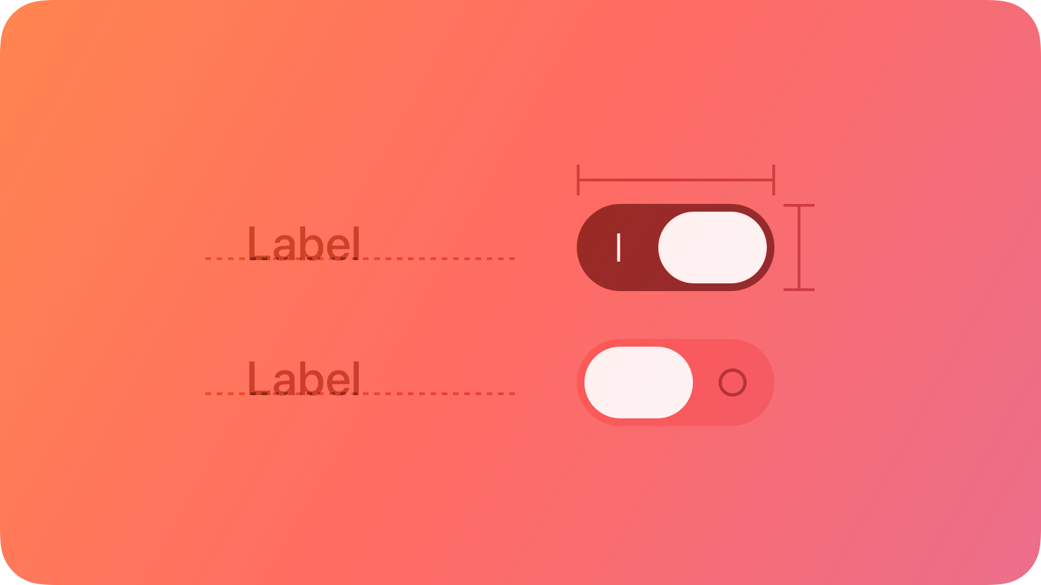
A toggle lets people choose between a pair of opposing states, like on and off, using a different appearance to indicate each state.
|
||
|
||
|
||
|
||
A toggle can have various styles, such as switch and checkbox, and different platforms can use these styles in different ways. For guidance, see [Platform considerations](https://developer.apple.com/design/human-interface-guidelines/toggles#Platform-considerations).
|
||
|
||
In addition to toggles, all platforms also support buttons that behave like toggles by using a different appearance for each state. For developer guidance, see [`ToggleStyle`](https://developer.apple.com/documentation/SwiftUI/ToggleStyle).
|
||
|
||
## [Best practices](https://developer.apple.com/design/human-interface-guidelines/toggles#Best-practices)
|
||
|
||
**Use a toggle to help people choose between two opposing values that affect the state of content or a view.** A toggle always lets people manage the state of something, so if you need to support other types of actions — such as choosing from a list of items — use a different component, like a [pop-up button](https://developer.apple.com/design/human-interface-guidelines/pop-up-buttons).
|
||
|
||
**Clearly identify the setting, view, or content the toggle affects.** In general, the surrounding context provides enough information for people to understand what they’re turning on or off. In some cases, often in macOS apps, you can also supply a label to describe the state the toggle controls. If you use a button that behaves like a toggle, you generally use an interface icon that communicates its purpose, and you update its appearance — typically by changing the background — based on the current state.
|
||
|
||
**Make sure the visual differences in a toggle’s state are obvious.** For example, you might add or remove a color fill, show or hide the background shape, or change the inner details you display — like a checkmark or dot — to show that a toggle is on or off. Avoid relying solely on different colors to communicate state, because not everyone can perceive the differences.
|
||
|
||
## [Platform considerations](https://developer.apple.com/design/human-interface-guidelines/toggles#Platform-considerations)
|
||
|
||
_No additional considerations for tvOS, visionOS, or watchOS._
|
||
|
||
### [iOS, iPadOS](https://developer.apple.com/design/human-interface-guidelines/toggles#iOS-iPadOS)
|
||
|
||
**Use the switch toggle style only in a list row.** You don’t need to supply a label in this situation because the content in the row provides the context for the state the switch controls.
|
||
|
||
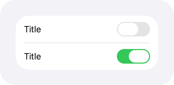
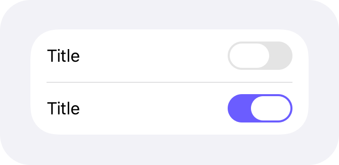
**Change the default color of a switch only if necessary.** The default green color tends to work well in most cases, but you might want to use your app’s accent color instead. Be sure to use a color that provides enough contrast with the uncolored appearance to be perceptible.
|
||
|
||
Standard switch color
|
||
|
||
Custom switch color
|
||
|
||
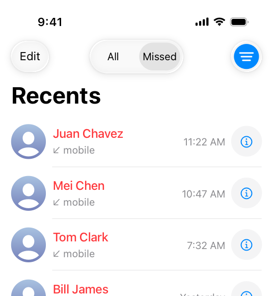
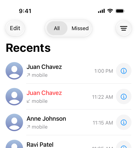
**Outside of a list, use a button that behaves like a toggle, not a switch.** For example, the Phone app uses a toggle on the filter button to let users filter their recent calls. The app adds a blue highlight to indicate when the toggle is active, and removes it when the toggle is inactive.
|
||
|
||
|
||
|
||
The Phone app uses a toggle to switch between all recent calls and various filter options. When someone chooses a filter, the toggle appears with a custom background drawn behind the symbol.
|
||
|
||
|
||
|
||
When someone returns to the main Recents view, the toggle appears without anything behind the symbol.
|
||
|
||
**Avoid supplying a label that explains the button’s purpose.** The interface icon you create — combined with the alternative background appearances you supply — help people understand what the button does. For developer guidance, see [`changesSelectionAsPrimaryAction`](https://developer.apple.com/documentation/UIKit/UIButton/changesSelectionAsPrimaryAction).
|
||
|
||
### [macOS](https://developer.apple.com/design/human-interface-guidelines/toggles#macOS)
|
||
|
||
In addition to the switch toggle style, macOS supports the checkbox style and also defines radio buttons that can provide similar behaviors.
|
||
|
||
**Use switches, checkboxes, and radio buttons in the window body, not the window frame.** In particular, avoid using these components in a toolbar or status bar.
|
||
|
||
#### [Switches](https://developer.apple.com/design/human-interface-guidelines/toggles#Switches)
|
||
|
||
**Prefer a switch for settings that you want to emphasize.** A switch has more visual weight than a checkbox, so it looks better when it controls more functionality than a checkbox typically does. For example, you might use a switch to let people turn on or off a group of settings, instead of just one setting. For developer guidance, see [`switch`](https://developer.apple.com/documentation/SwiftUI/ToggleStyle/switch).
|
||
|
||
**Within a grouped form, consider using a mini switch to control the setting in a single row.** The height of a mini switch is similar to the height of buttons and other controls, resulting in rows that have a consistent height. If you need to present a hierarchy of settings within a grouped form, you can use a regular switch for the primary setting and mini switches for the subordinate settings. For developer guidance, see [`GroupedFormStyle`](https://developer.apple.com/documentation/SwiftUI/GroupedFormStyle) and [`ControlSize`](https://developer.apple.com/documentation/SwiftUI/ControlSize).
|
||
|
||
**In general, don’t replace a checkbox with a switch.** If you’re already using a checkbox in your interface, it’s probably best to keep using it.
|
||
|
||
#### [Checkboxes](https://developer.apple.com/design/human-interface-guidelines/toggles#Checkboxes)
|
||
|
||
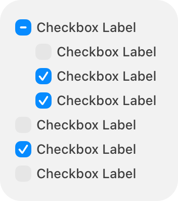
A checkbox is a small, square button that’s empty when the button is off, contains a checkmark when the button is on, and can contain a dash when the button’s state is mixed. Typically, a checkbox includes a title on its trailing side. In an editable checklist, a checkbox can appear without a title or any additional content.
|
||
|
||
**Use a checkbox instead of a switch if you need to present a hierarchy of settings.** The visual style of checkboxes helps them align well and communicate grouping. By using alignment — generally along the leading edge of the checkboxes — and indentation, you can show dependencies, such as when the state of a checkbox governs the state of subordinate checkboxes.
|
||
|
||
|
||
|
||
**Consider using radio buttons if you need to present a set of more than two mutually exclusive options.** When people need to choose from options in addition to just “on” or “off,” using multiple radio buttons can help you clarify each option with a unique label.
|
||
|
||
**Consider using a label to introduce a group of checkboxes if their relationship isn’t clear.** Describe the set of options, and align the label’s baseline with the first checkbox in the group.
|
||
|
||
**Accurately reflect a checkbox’s state in its appearance.** A checkbox’s state can be on, off, or mixed. If you use a checkbox to globally turn on and off multiple subordinate checkboxes, show a mixed state when the subordinate checkboxes have different states. For example, you might need to present a text-style setting that turns all styles on or off, but also lets people choose a subset of individual style settings like bold, italic, or underline. For developer guidance, see [`allowsMixedState`](https://developer.apple.com/documentation/AppKit/NSButton/allowsMixedState).
|
||
|
||
On
|
||
|
||
Off
|
||
|
||
Mixed
|
||
|
||
#### [Radio buttons](https://developer.apple.com/design/human-interface-guidelines/toggles#Radio-buttons)
|
||
|
||
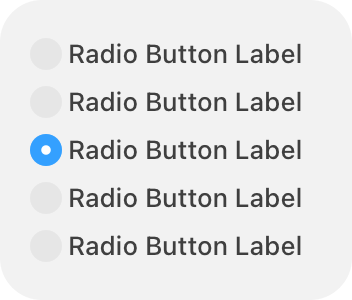
A radio button is a small, circular button followed by a label. Typically displayed in groups of two to five, radio buttons present a set of mutually exclusive choices.
|
||
|
||
|
||
|
||
A radio button’s state is either selected (a filled circle) or deselected (an empty circle). Although a radio button can also display a mixed state (indicated by a dash), this state is rarely useful because you can communicate multiple states by using additional radio buttons. If you need to show that a setting or item has a mixed state, consider using a checkbox instead.
|
||
|
||
Selected
|
||
|
||
Deselected
|
||
|
||
**Prefer a set of radio buttons to present mutually exclusive options.** If you need to let people choose multiple options in a set, use checkboxes instead.
|
||
|
||
**Avoid listing too many radio buttons in a set.** A long list of radio buttons takes up a lot of space in the interface and can be overwhelming. If you need to present more than about five options, consider using a component like a [pop-up button](https://developer.apple.com/design/human-interface-guidelines/pop-up-buttons) instead.
|
||
|
||
**To present a single setting that can be on or off, prefer a checkbox.** Although a single radio button can also turn something on or off, the presence or absence of the checkmark in a checkbox can make the current state easier to understand at a glance. In rare cases where a single checkbox doesn’t clearly communicate the opposing states, you can use a pair of radio buttons, each with a label that specifies the state it controls.
|
||
|
||
**Use consistent spacing when you display radio buttons horizontally.** Measure the space needed to accommodate the longest button label, and use that measurement consistently.
|
||
|
||

|
||
|
||
## [Resources](https://developer.apple.com/design/human-interface-guidelines/toggles#Resources)
|
||
|
||
#### [Related](https://developer.apple.com/design/human-interface-guidelines/toggles#Related)
|
||
|
||
[Layout](https://developer.apple.com/design/human-interface-guidelines/layout)
|
||
|
||
#### [Developer documentation](https://developer.apple.com/design/human-interface-guidelines/toggles#Developer-documentation)
|
||
|
||
[`Toggle`](https://developer.apple.com/documentation/SwiftUI/Toggle) — SwiftUI
|
||
|
||
[`UISwitch`](https://developer.apple.com/documentation/UIKit/UISwitch) — UIKit
|
||
|
||
[`NSButton.ButtonType.toggle`](https://developer.apple.com/documentation/AppKit/NSButton/ButtonType/toggle) — AppKit
|
||
|
||
[`NSSwitch`](https://developer.apple.com/documentation/AppKit/NSSwitch) — AppKit
|
||
|
||
## [Change log](https://developer.apple.com/design/human-interface-guidelines/toggles#Change-log)
|
||
|
||
Date| Changes
|
||
---|---
|
||
March 29, 2024| Enhanced guidance for using switches in macOS apps, clarified when a checkbox has a title, and added artwork for radio buttons.
|
||
September 12, 2023| Updated artwork.
|
||
|